Monday
Aug252008
Embroidery colours
 Monday, August 25, 2008 at 4:25AM
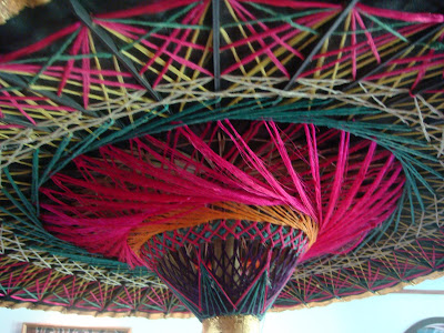
I love the richness of the colour here. The rooms are rather dark during the daytime, shady and cool and the colours appear subdued and understated. But add a little light - sunshine or electric - and they pop out, bright pinks, greens and yellows all used together with, it seems, little or no "design". I would never have used these combinations and would most probably only stick to a very considered palette of carefully chosen colours.
The two parasols at either end of the enormous sofa are another riot of colour. They don't match but it doesn't seem to matter and that bit of gold "bling" makes all the difference.

I think it's really effective, proving that whole-hearted works better than half. What do you think?
tagged  Thailand in
  textiles,
  travelling
 Thailand in
  textiles,
  travelling


Reader Comments (2)
Love the parasol and the colours! Hope you got back OK.
sort of different palette but along the lines of Kaffe Fassett, no? I heard him speak once and he said if you think you are in trouble, add 5 more colors. You're right though, we are all a bit cautious. The other side is that these look great in the light there, I do think the light here (wherever here is) is different. Inhibitions! sigh